
BIOSOMES
Product Launch
Strategy • Moodboarding • Set Styling • Art Direction • Video • Design • AI

SUMMARY
AnteAGE Biosomes represent the future of regenerative skincare, arriving at a pivotal moment when science meets scalability. The world's first biomimetic exosomes deliver the regenerative power of human-derived healing signals without requiring human donors, solving the aesthetic industry's most persistent challenge: consistency at scale. These synthetic nanoparticles are engineered with precision to replicate natural exosome function while delivering 25 billion targeted regenerative signals per treatment. Where traditional exosome therapies faced variability and supply limitations, Biosomes offer pharmaceutical-grade consistency through advanced microfluidic engineering. The campaign transforms AnteAGE from a growth factor pioneer into a biotechnology visionary, positioning the brand at the forefront of cell-free regenerative medicine. By harnessing laboratory precision to recreate nature's most sophisticated cellular communication system, Biosomes represents not just product innovation but a fundamental reimagining of how we approach skin regeneration – delivering the promise of personalized medicine through standardized excellence.

STRATEGY
Imagery
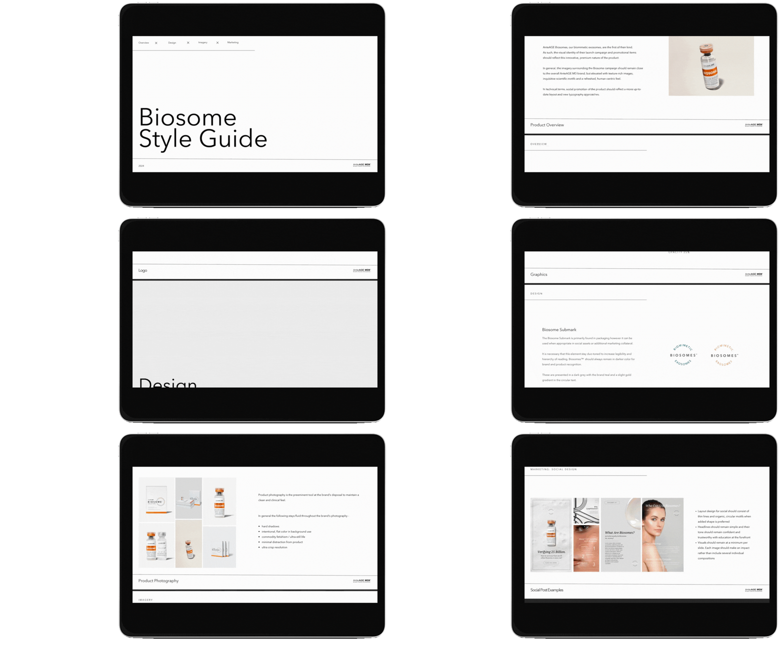
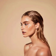
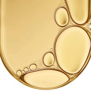
The visual language elevates scientific sophistication through ethereal beauty, capturing the revolutionary nature of biomimetic technology without sacrificing the warm humanity that defines great skincare. Photography embraces the microscopic wonder of cellular communication through macro details of dewdrops, light refraction through glass spheres, and the organic geometry found in soap bubbles – visual metaphors for the 100-nanometer Biosomes themselves. The imagery reflects how these synthetic particles communicate with cells to increase firmness, reduce redness, and improve texture, translating complex science into accessible beauty through clean, luminous compositions. Models appear in states of peaceful transformation, their skin catching natural light to emphasize the "glow from within" that comes from cellular regeneration. Product photography leverages the amber-orange Biosome vial as a beacon of innovation, using gradient lighting and prismatic effects to suggest the advanced engineering within. The overall aesthetic balances clinical precision with organic warmth, positioning Biosomes as both cutting-edge science and natural evolution.

Coloring
The palette captures the essence of laboratory precision merged with organic vitality, anchored by the distinctive amber-orange of the Biosome vial that signals innovation and efficacy. Crisp whites dominate backgrounds to emphasize the clinical purity and consistency that defines biomimetic technology, while soft pearl and opalescent gradients reference the lipid nanoparticles themselves. The amber serves as the hero accent, evoking both precious scientific discovery and the warm glow of regenerated skin. Cool blue-grays provide technical sophistication without sterility, suggesting the controlled laboratory environment where these synthetic marvels are created. Subtle gold highlights reference the premium positioning while warm beige tones maintain connection to diverse skin types. This carefully calibrated palette ensures the campaign feels both groundbreaking and approachable, supporting the message that revolutionary science can deliver beautifully natural results.
Type
Typography balances scientific authority with accessible elegance, requiring fonts that can navigate between technical precision and beauty editorial sophistication. The primary typeface demonstrates contemporary refinement with subtle technological influences, suggesting the advanced microfluidic engineering behind Biosome creation without overwhelming the luxury skincare positioning. Supporting typography incorporates clean, geometric elements that reference laboratory precision and pharmaceutical-grade consistency, while maintaining the warmth necessary for beauty communication. Headlines require fonts that can carry both the weight of "world's first biomimetic exosome" and the aspirational promise of "regenerated skin," balancing innovation announcements with transformation stories. The typographic hierarchy guides users through complex scientific concepts with the same elegance they'd expect from luxury skincare, making breakthrough technology feel both revolutionary and trustworthy.
Tone
The tone positions AnteAGE as the visionary architect of regenerative beauty's future, speaking with the confidence of scientific pioneers who've solved the industry's greatest challenge. The voice celebrates being "first" – the first biomimetic exosome, the first synthetic alternative to deliver exosome benefits without human donors while maintaining the approachable authority that builds trust in revolutionary technology. Communication emphasizes precision and consistency over experimental uncertainty, positioning Biosomes as the reliable evolution of an already-proven science. Rather than overwhelming with technical details, the voice focuses on transformational outcomes: firmer skin, accelerated healing, consistent results.
Planning
Moodboarding
PACKAGING + UPDATES
Daily Skincare
 Old Packaging |  New Packaging |
|---|

Treatment Solutions
 |  |  |
|---|---|---|
 |  |  |
Old Packaging
 |  |  |
|---|---|---|
 |  |  |
New Packaging

CAMPAIGN SUPPORT
AI Campaign Imagery

Tradeshow Booths
Social

Print Assets

Launch Event Promo


